# box-sizing样式解析
# content-box属性
content-box中文翻译是内容盒子、内容框。表示什么含义呢?
box-sizing - CSS:层叠样式表 | MDN (opens new window)
官方文档描述有以下几点总结:
- content-box是box-sizing样式的默认属性。
- content-box是用来固定盒子内容区域的值。什么意思呢?如果盒子的宽度设置为100px,那么在设置box-sizing为content-box时,盒子的内容宽度就是盒子的宽度。其它边的宽度、padding宽度、margin宽度都没算。
# border-box属性
border-box中文翻译是边框盒子。
官方文档描述有以下几点总结:
- 将一个元素的 width 设为 100px。盒子宽度(用户设置width的值) = border值 + padding值。
- 盒子内容区域的宽 = 盒子宽度(用户设置width的值)- ( border值 + padding值)。
# box-sizing小总结
设置box-sizing样式content-box、border-box值的目的就是为了可以灵活的去改变width、height样式设置的值的作用效果。
- 情况1决定width、height是表示内容区域的宽、高。
- 情况2决定 内容区域宽高 + border宽高 + padding宽高。
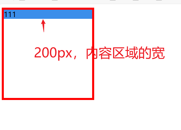
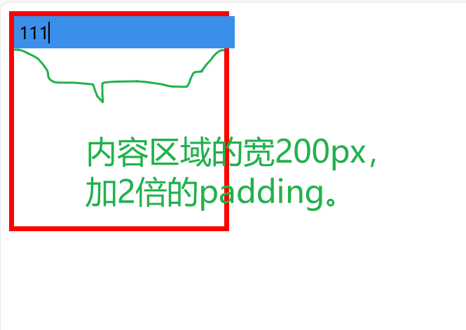
# content-box案例
指定width设置的宽度是内容的宽度。
<!DOCTYPE html>
<html lang="en">
<head>
    <meta charset="UTF-8">
    <title>Title</title>
    <style>
        .parent-container {
            border: 5px solid red;
            width: 200px;
            height: 200px;
        }
        .child-container {
            box-sizing: content-box;
            width: 100%;
            background-color: #3B8EEA;
        }

    </style>
</head>
<body>
<div class="parent-container">
    <div class="child-container">
        111
    </div>
</div>
</body>
</html>
1
2
3
4
5
6
7
8
9
10
11
12
13
14
15
16
17
18
19
20
21
22
23
24
25
26
27
2
3
4
5
6
7
8
9
10
11
12
13
14
15
16
17
18
19
20
21
22
23
24
25
26
27
<!DOCTYPE html>
<html lang="en">
<head>
    <meta charset="UTF-8">
    <title>Title</title>
    <style>
        .parent-container {
            border: 5px solid red;
            width: 200px;
            height: 200px;
        }
        .child-container {
            box-sizing: content-box;
            width: 100%;
            background-color: #3B8EEA;
            padding: 5px;
        }

    </style>
</head>
<body>
<div class="parent-container">
    <div class="child-container">
        111
    </div>
</div>
</body>
</html>
1
2
3
4
5
6
7
8
9
10
11
12
13
14
15
16
17
18
19
20
21
22
23
24
25
26
27
28
2
3
4
5
6
7
8
9
10
11
12
13
14
15
16
17
18
19
20
21
22
23
24
25
26
27
28
# content-box与border-box对比案例
<!DOCTYPE html>
<html lang="en">
<head>
    <meta charset="UTF-8">
    <title>Title</title>
    <style>
        div {
            width: 160px;
            height: 80px;
            padding: 20px;
            border: 8px solid red;
            background: yellow;
        }

        .content-box {
            box-sizing: content-box;
            /* Total width: 160px + (2 * 20px) + (2 * 8px) = 216px
               Total height: 80px + (2 * 20px) + (2 * 8px) = 136px
               Content box width: 160px
               Content box height: 80px */
        }

        .border-box {
            box-sizing: border-box;
            /* Total width: 160px
               Total height: 80px
               Content box width: 160px - (2 * 20px) - (2 * 8px) = 104px
               Content box height: 80px - (2 * 20px) - (2 * 8px) = 24px */
        }
    </style>
</head>
<body>
<div class="content-box">Content box</div>
<br/>
<div class="border-box">Border box</div>
</body>
</html>div {
  width: 160px;
  height: 80px;
  padding: 20px;
  border: 8px solid red;
  background: yellow;
}

.content-box {
  box-sizing: content-box;
  /* Total width: 160px + (2 * 20px) + (2 * 8px) = 216px
     Total height: 80px + (2 * 20px) + (2 * 8px) = 136px
     Content box width: 160px
     Content box height: 80px */
}

.border-box {
  box-sizing: border-box;
  /* Total width: 160px
     Total height: 80px
     Content box width: 160px - (2 * 20px) - (2 * 8px) = 104px
     Content box height: 80px - (2 * 20px) - (2 * 8px) = 24px */
}
1
2
3
4
5
6
7
8
9
10
11
12
13
14
15
16
17
18
19
20
21
22
23
24
25
26
27
28
29
30
31
32
33
34
35
36
37
38
39
40
41
42
43
44
45
46
47
48
49
50
51
52
53
54
55
56
57
58
59
2
3
4
5
6
7
8
9
10
11
12
13
14
15
16
17
18
19
20
21
22
23
24
25
26
27
28
29
30
31
32
33
34
35
36
37
38
39
40
41
42
43
44
45
46
47
48
49
50
51
52
53
54
55
56
57
58
59
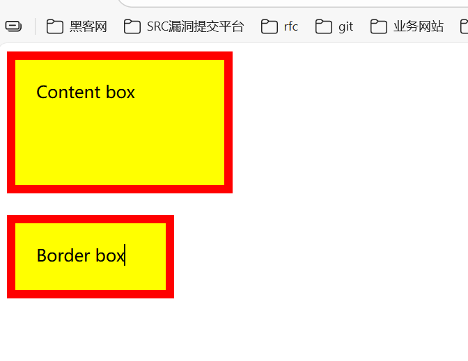
content 盒子宽高度的计算:
content box 实际盒子的宽度(眼睛看到的盒子宽度)= width: 160px + padding: 20px * 2 + border: 8px * 2 = 216px
content box 实际盒子的高度(眼睛看到的盒子高度)= height: 80px + padding: 20px * 2 + border: 8px * 2 = 136px
border-box盒子宽高度的计算:
 Content box width: 160px - (2 * 20px) - (2 * 8px) = 104px
 Content box height: 80px - (2 * 20px) - (2 * 8px) = 24px
# 语法总结
box-sizing = content-box | border-box
1
CSS Box Sizing Module Level 3 (opens new window)
# 技巧
* {
  box-sizing: border-box;
}
1
2
3
2
3
这使得处理元素大小的工作变得容易得多,并且通常消除了在布局内容时可能遇到的许多陷阱。然而,在某些情况下,你应谨慎使用这个属性。例如:你正在编写一个将由其他人使用的共享组件库,如果他们网站的其余部分没有设置此值,他们可能会发现很难使用你的组件库。